
The website needed to retain the character of the identity without treating static brand compositions as fixed templates.
The website needed to retain the character of the identity without treating static brand compositions as fixed templates.

Creating a refined digital presence for a specialist property brand through a partner-led rebrand and bespoke website build.
Project overview
Pierre Angulaire required a new website following a wider brand development project delivered with a specialist creative partner.
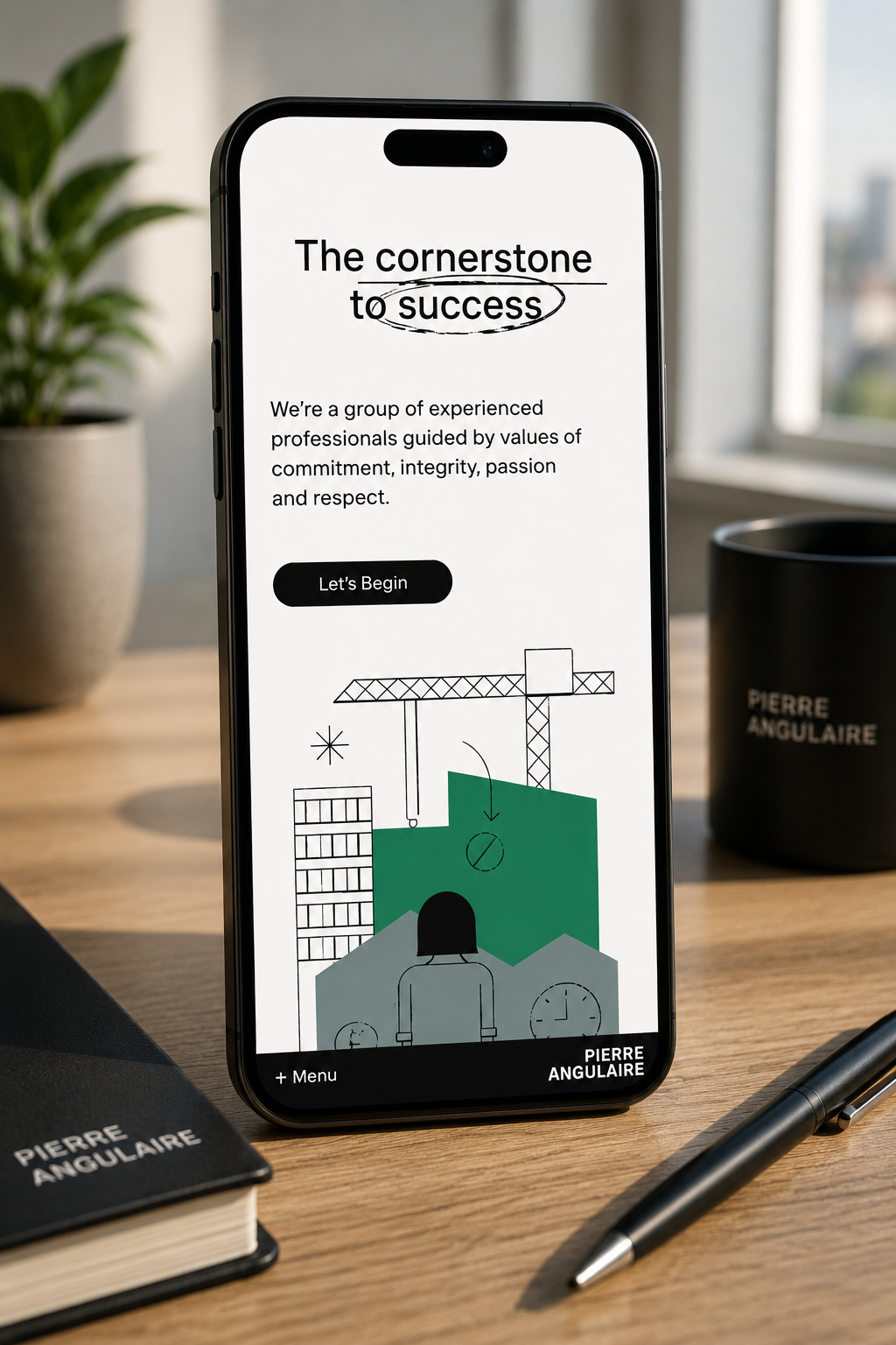
The digital experience needed to preserve the sophistication and restraint of the identity while remaining practical across different devices, changing content lengths and future updates.
Jublo translated the visual direction into a bespoke responsive Statamic site, focusing on typography, imagery, layout and subtle interaction to create an experience that felt considered without becoming over-designed.
The challenge
With a deliberately minimal identity, small inconsistencies in typography, spacing or imagery become much more noticeable.
The website needed to retain the character of the identity without treating static brand compositions as fixed templates.
Large imagery needed to remain effective across different aspect ratios and screen sizes.
Scale, spacing and line length were central to maintaining the intended visual tone.
Layouts designed around generous desktop space needed considered restructuring for smaller screens.
Animation and transitions needed to add polish without distracting from the work and content.
The client still needed a manageable platform that could evolve without undermining the visual system.
Our role
Jublo collaborated with the brand partner to interpret the new identity across a live responsive environment and then delivered the technical implementation.
Our work covered front-end engineering, WordPress development, responsive behaviour, image treatment, typography, interaction, technical optimisation and launch.
The focus throughout was on preserving the restraint of the visual language while ensuring the website remained practical to use, maintain and extend.
Our approach
Every engagement begins with understanding the organisation, the people involved and the outcome that matters. From there, we challenge assumptions, make deliberate decisions and engineer technology that can continue to evolve.
We identified the visual principles that made the new identity distinctive, including typography, proportion, imagery and use of space.
Rather than adding unnecessary interface treatment, the website structure was kept intentionally restrained so the content and visual identity could remain dominant.
Layouts were translated into responsive relationships rather than fixed desktop arrangements, allowing typography and imagery to respond naturally to screen size.
Spacing, image crops, mobile layouts and interaction were tested repeatedly because small inconsistencies become more visible in a minimal design.
The finished site was structured so future content and technical maintenance could be handled without gradually eroding the design system.
Capabilities
Brand-to-digital implementation
Responsive web development
Bespoke WordPress development
Image-led interface design
Typography systems
Mobile-specific layouts
Interaction design
CMS architecture
Performance optimisation
Technical SEO
Ongoing website maintenance
The outcome
The visual identity translates coherently from brand materials into a working digital environment.
Key layouts retain their hierarchy and visual quality rather than becoming compromised on smaller screens.
The client can continue updating the site while the underlying design system preserves consistency.
The technical foundation supports ongoing optimisation and improvement without requiring the website to be continually rebuilt.